
Gartner Digital Markets isn't just a business unit within Gartner, Inc. – it's a passionate team on a mission. Our goal was to personally empower organizations to supercharge growth by guiding them toward the perfect technology and services. Think of the brands as more than just a marketplace; Capterra, GetApp, and Software Advice are your dedicated partners, forming an intimate network that's your go-to global source for discovering and evaluating software and services.
Much like the approach taken with the other brands, the development of Software Advice's visual identity was a careful and deliberate journey. We delved into extensive market analysis, aiming to grasp the distinct nuances of our audience's preferences and expectations. Armed with these insights, we set out to create a visual language that not only reflected Software Advice's values but also resonated with our audience by embodying the ethos of always being able to connect with a human.
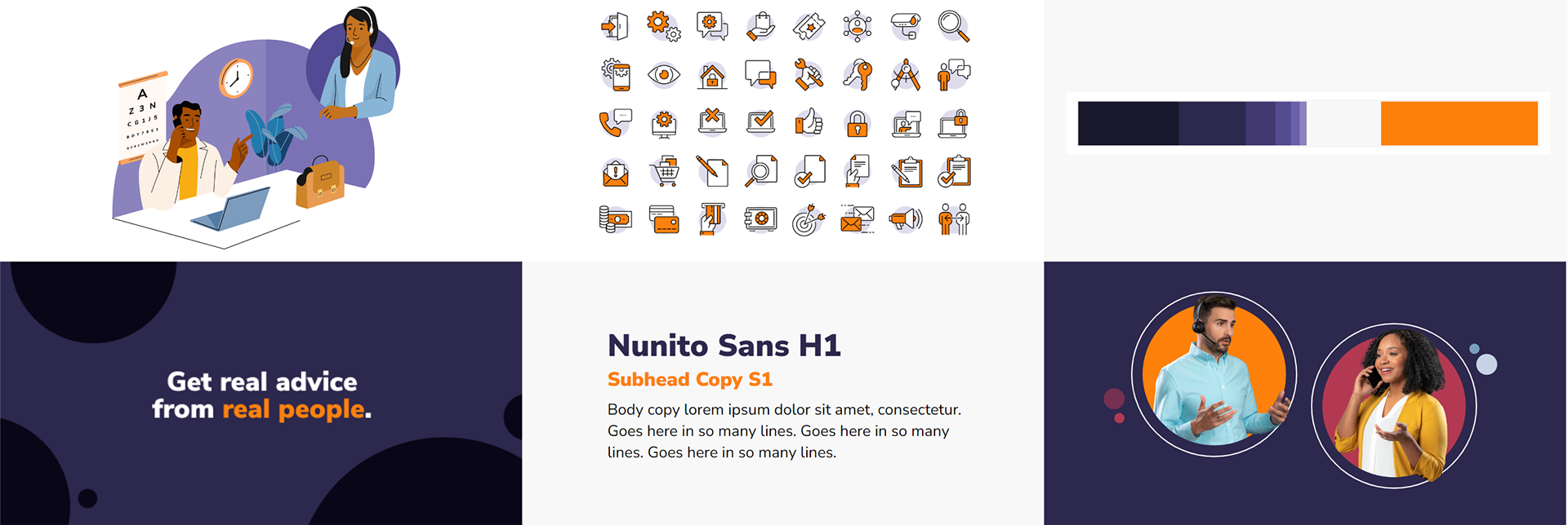
To carve out a unique space in the competitive landscape, we opted for a warmer color palette, infusing a sense of approachability and friendliness into the visual expression. Our illustration and photography systems were strategically crafted to emphasize more organic shapes, setting Software Advice apart from our other two brands and contributing to a visual identity that exuded a harmonious blend of warmth and wanting to help.
Illustration System
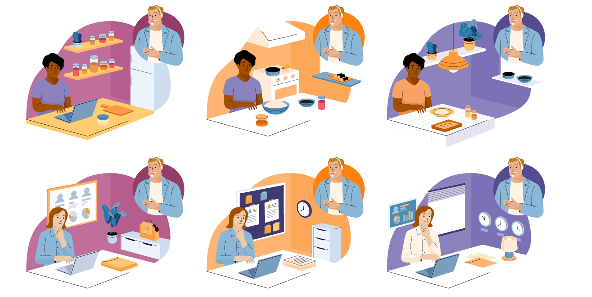
The heart of our illustration system was designed with one core principle: modularity. In order to meet the demands of our content team, the system we created needed to empower every team member, regardless of their illustrative background, to effortlessly create narratively-driven visual compositions on the fly. In addition to the technical modularity, this system also needed visual modularity to convey narratives across a vast spectrum of 950 software categories (and growing) while maintaining uniqueness in the market and feeling at home within the Software Advice visual identity.

Modular backgrounds made telling stories across categories easy.

Compositions were designed to tell stories that showed how an advisor could help, but was modular enough to function without this treatment as well.
Teaming up with Cami Dobrin in the initial stages and transitioning into the development phase with Gustavo Bouyrie, we embarked on the journey of establishing the foundations for this intricate system. Once we cracked the compositional formula we knew could work across the subject matter we knew we'd need to represent, we worked to expand the library of elements used to build up compositions. Anything from people figures to lamps and plants for an office setting background - each composition was made so that you could replace certain elements with different parts from the library and tell a whole new story.
The collaborative spirit endured and thrived as our creative family expanded with the invaluable addition of Arina Astashova. This synergy became the driving force behind the evolution of the Software Advice illustration system. The culmination of our collective efforts resulted in a cohesive and dynamic visual library that not only met the demands of our creative endeavors but also embodied the essence of a brand our audience liked to engage with.
Commercial
Creative Direction: Ladon Roeder; Art Direction: Garvin G. Grullón
YouTube Ad featuring the illustration and animation style of the brand.