The Counter Narrative Project of Atlanta is instrumental in challenging and reshaping societal narratives concerning black gay men and addressing their intersecting issues. Committed to fostering a positive and empowering counter-narrative, the organization actively counters stereotypes, stigmas, and discrimination. Through initiatives such as advocacy, storytelling, and community engagement, the Counter Narrative Project amplifies the voices and experiences of black gay men.
When tasked with leading the organization's rebrand and developing a comprehensive marketing strategy, I collaborated closely with the founder and CEO, Charles Stephens, and their Deputy Director of Strategy and Impact, Johnnie Ray Kornegay III. Together, we delved into the creative requirements, aiming for a design system that effortlessly maintained cohesion, ensuring ease of execution even without a designer present. Additionally, our objective was to craft a symbol that powerfully encapsulated our mission of advocacy and outspokenness on social issues affecting black gay men.
When tasked with leading the organization's rebrand and developing a comprehensive marketing strategy, I collaborated closely with the founder and CEO, Charles Stephens, and their Deputy Director of Strategy and Impact, Johnnie Ray Kornegay III. Together, we delved into the creative requirements, aiming for a design system that effortlessly maintained cohesion, ensuring ease of execution even without a designer present. Additionally, our objective was to craft a symbol that powerfully encapsulated our mission of advocacy and outspokenness on social issues affecting black gay men.
Brand Identity
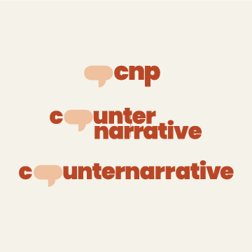


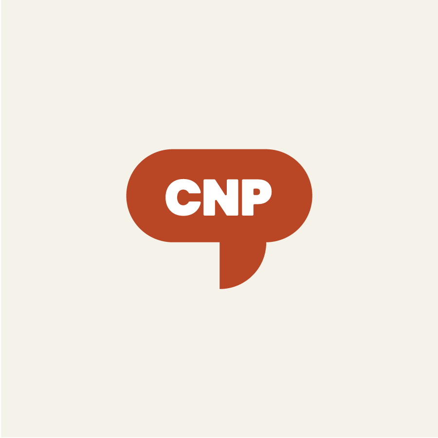


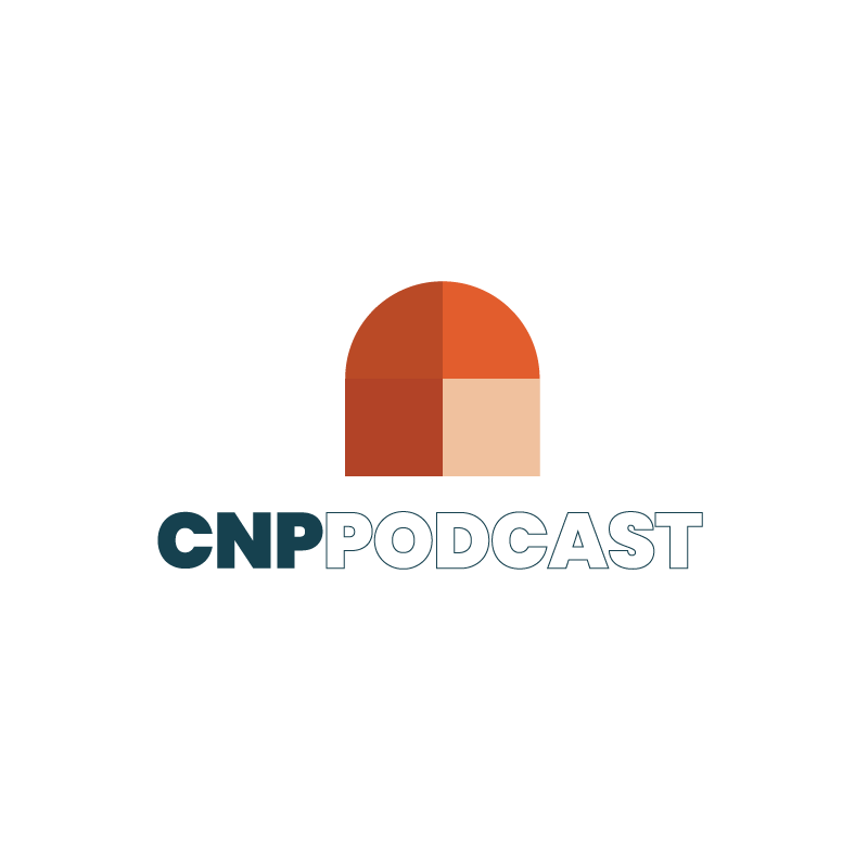
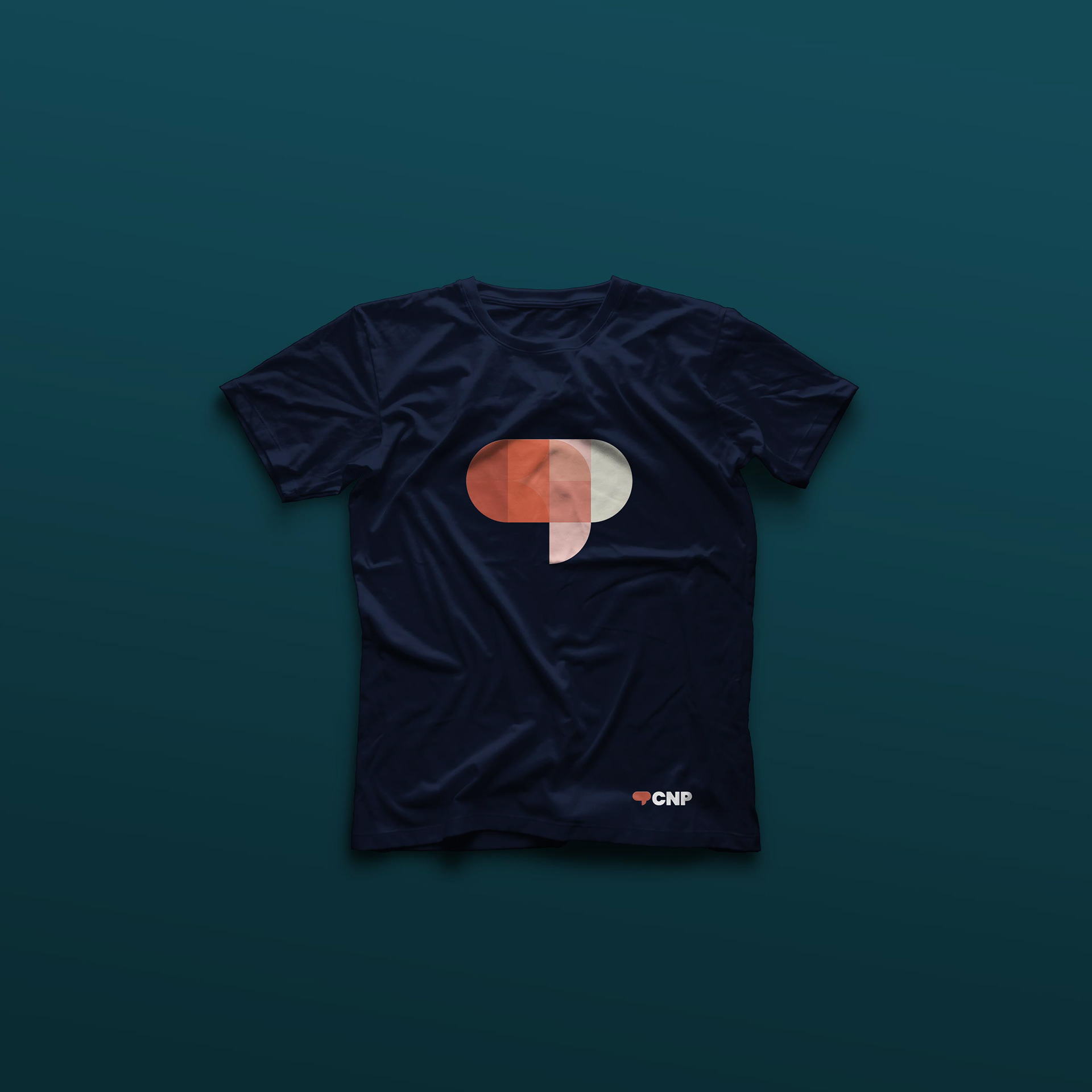
I strongly resonated with the concept of uniting people and employing advocacy to amplify the voices of those who cannot speak for themselves. While the Counter Narrative Project had previously incorporated a speech bubble in their logogram, I decided to revisit the idea, opting for a more modern, vibrant approach using geometric shapes. Beyond reimagining the parent brand, I had the chance to rebrand several of their products and sub-brands. Each adhered to the same geometric system, intending to craft a symbol that mirrored the medium or subject matter offered by each product
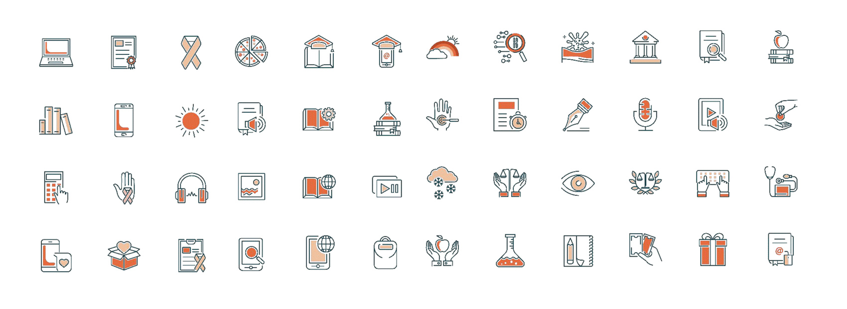
The Counter Narrative Project uses iconography as a simple graphic expression so I wanted to ensure they had a number of options for the background recommendations I made within the color system.

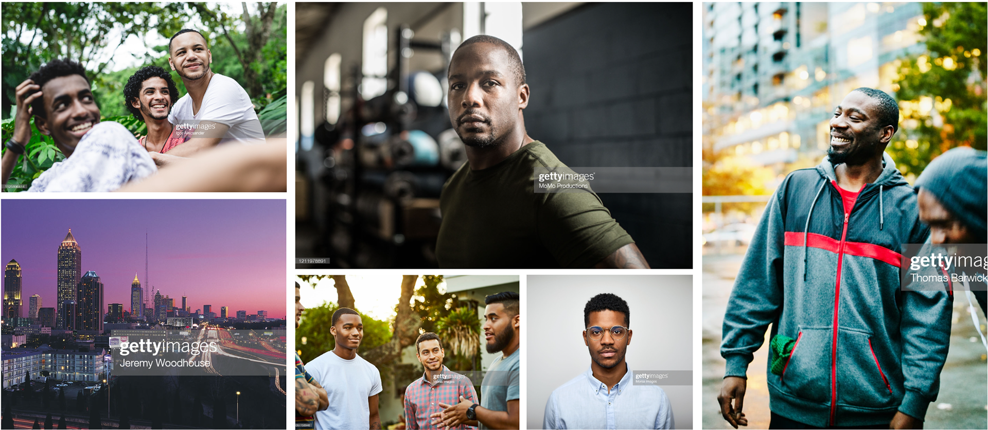
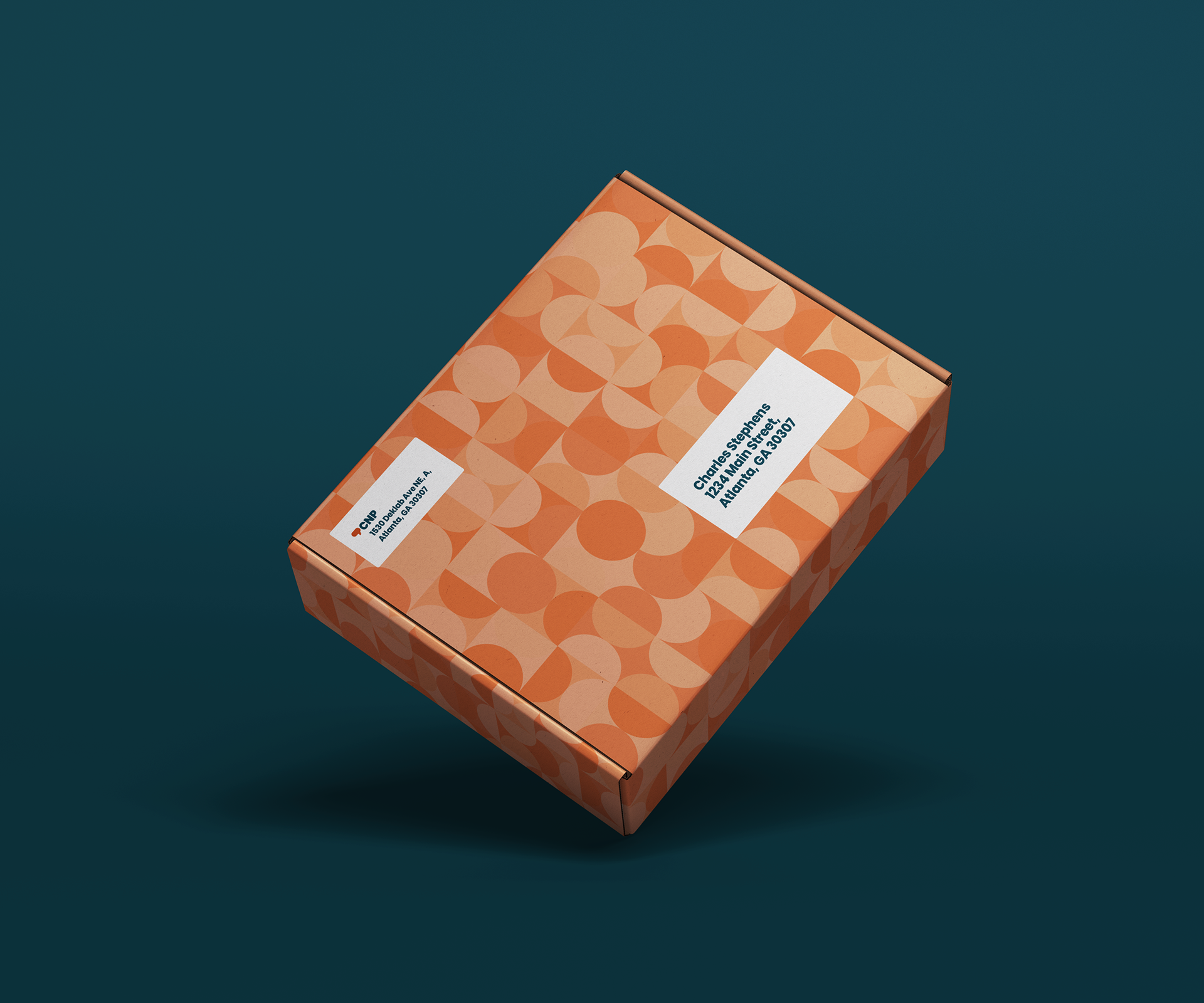
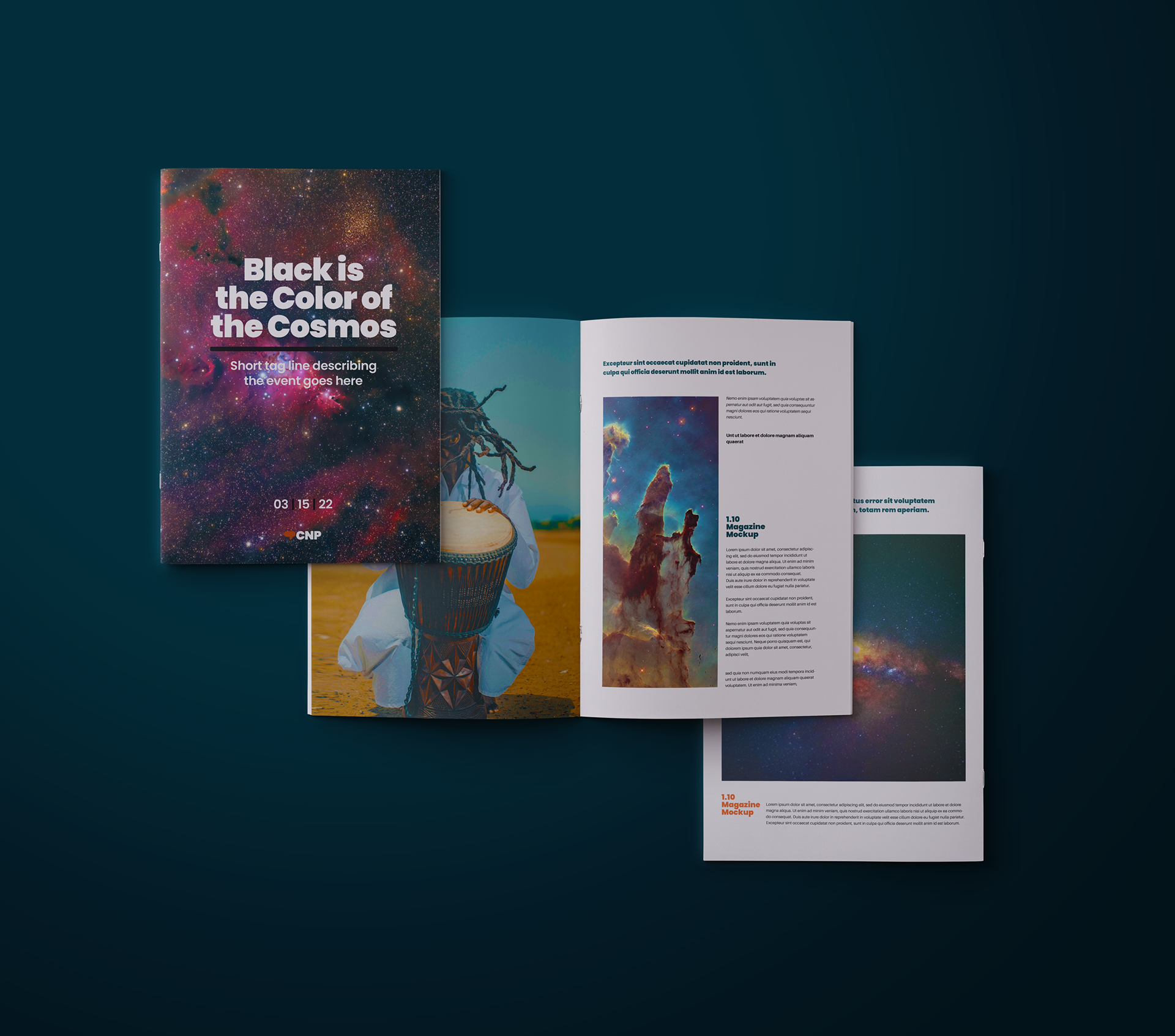
Photography is a huge part of the visual expression for this brand - and whether we are showing historical photos representing our forefathers or inspirational leaders, or we are telling modern stories through the lens of today's black gay youth, I wanted to provide clarity on the types of photos that have impact - and help them steer away from stock imagery that felt too static, generic or devoid of soul.
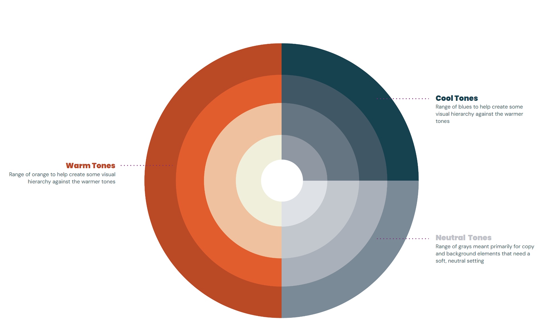
This color wheel is designed to help the team understand the color hierarchy intended for the brand.
I wanted the team to understand what I intended with the different color hierarchies so I provided a few options to help them understand how to keep the color system feeling consistent and cohesive.
Programs & Events


Digital Templates
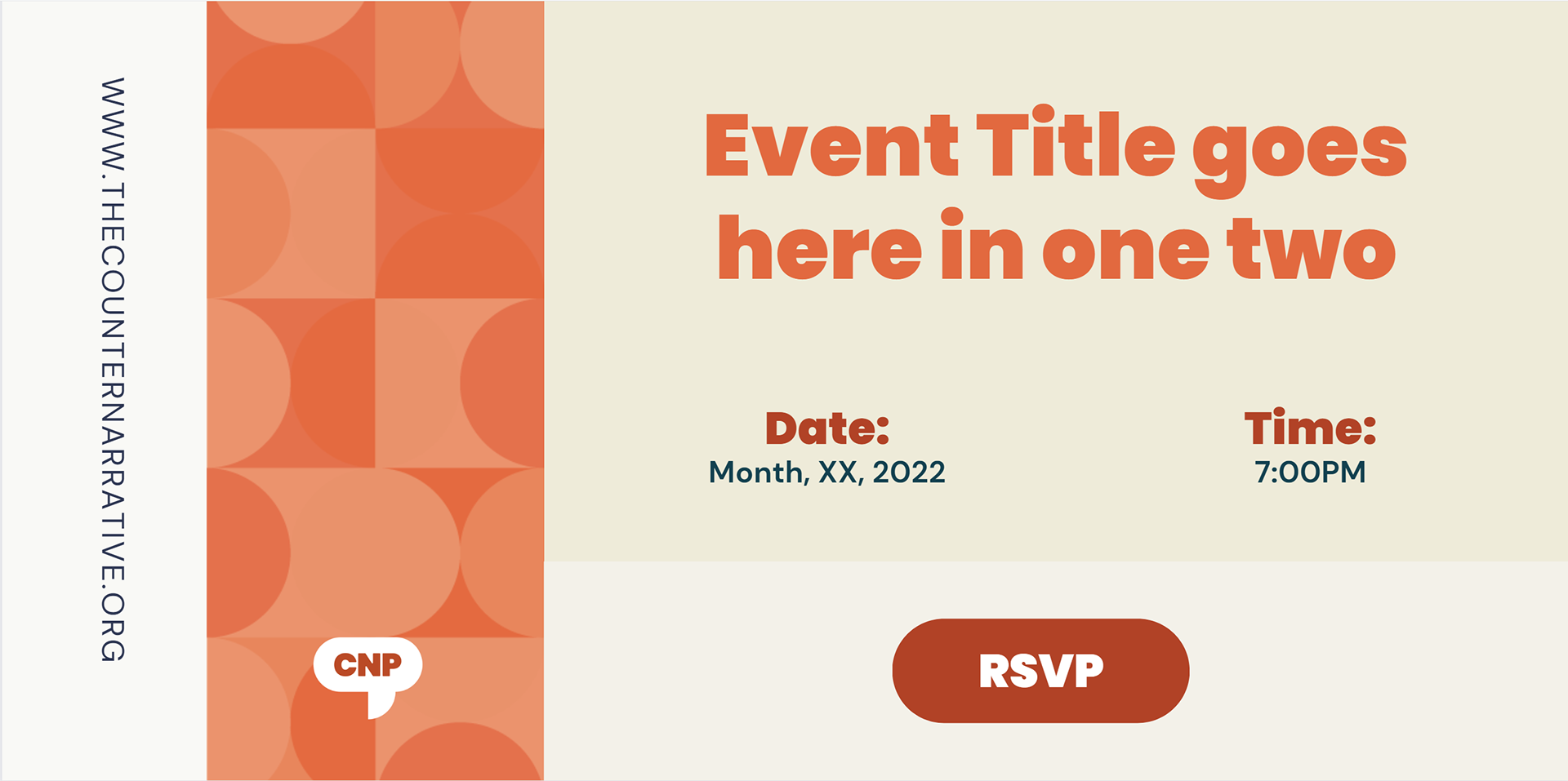
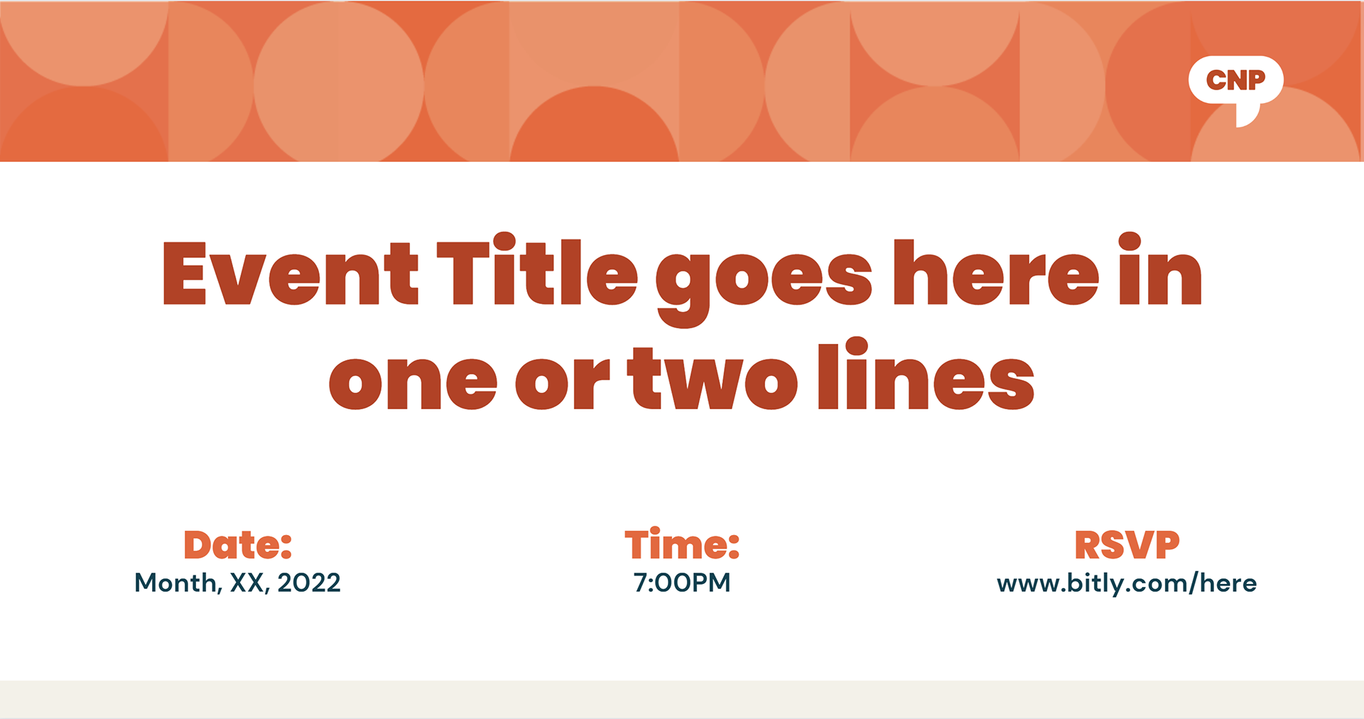
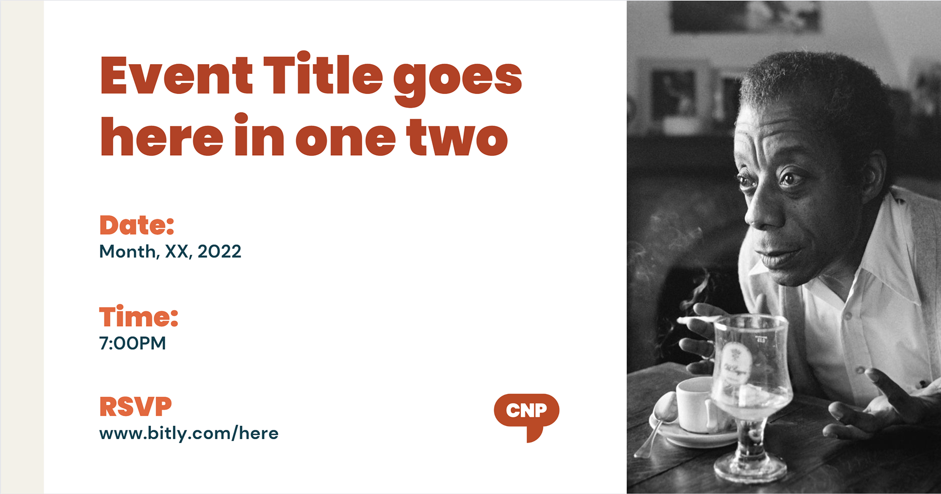

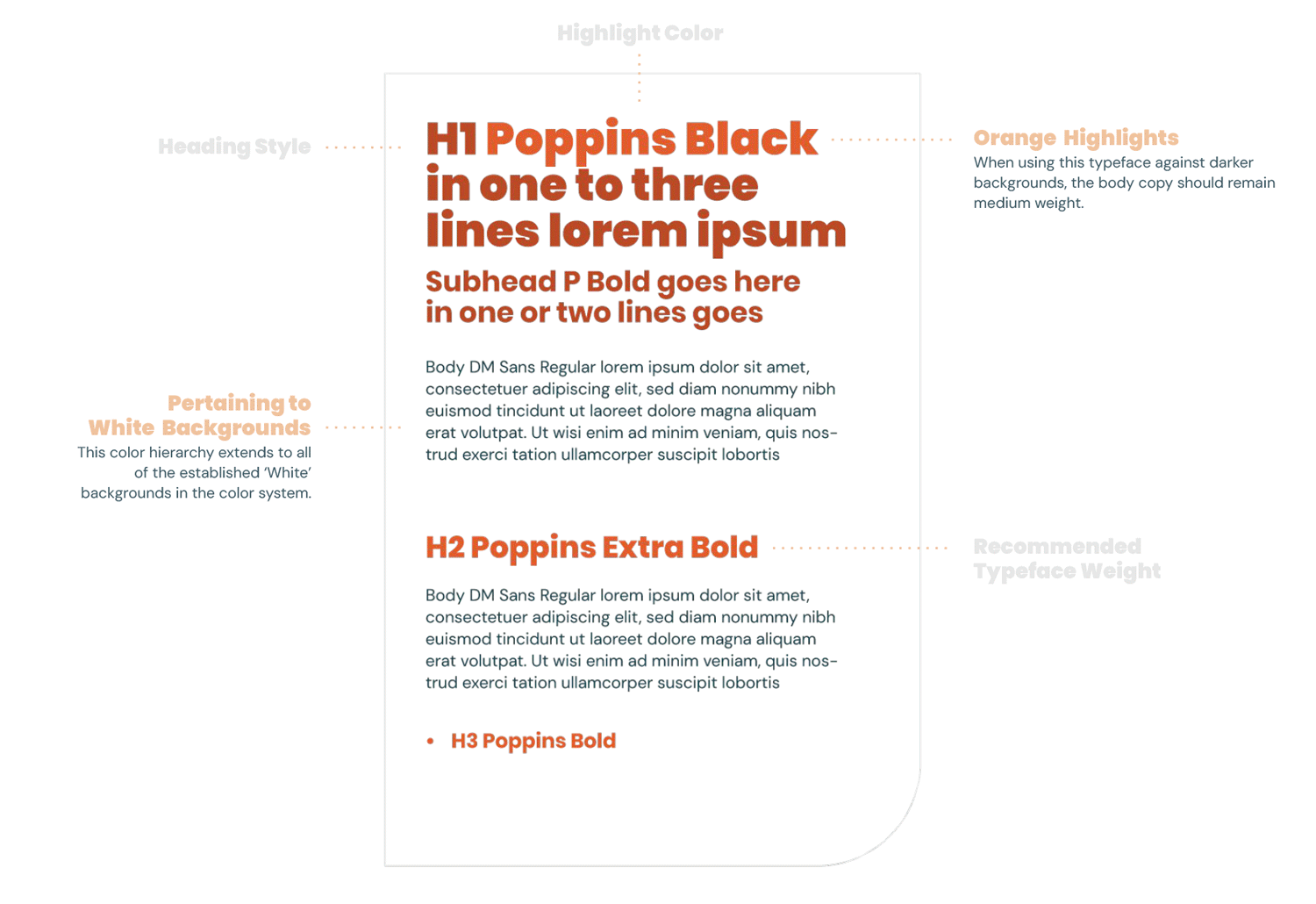
It was important that the system I left for the team gave them autonomy to create without the aid of a designer or creative director. I used Canva to help build a system of templates that empowered their teams to work within the brand with the confidence that they were perpetuating the pieces and parts correctly. These are some of the modular templates I created for social objects and header elements for their monthly newsletter.
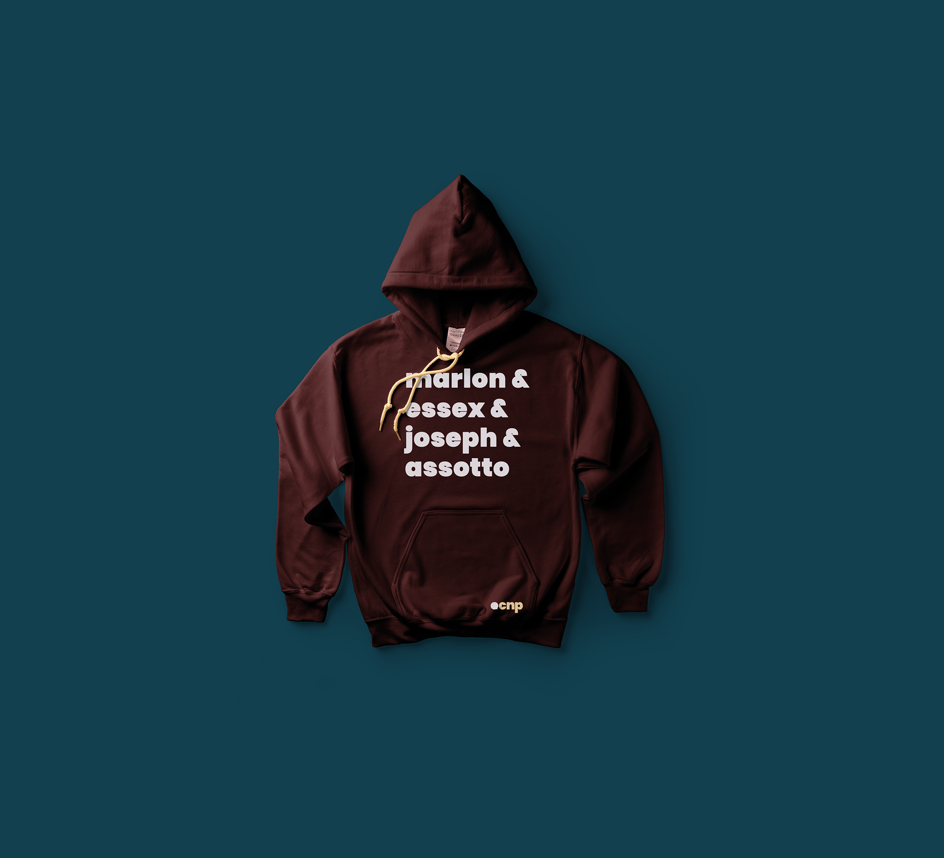
Apparel