
Gartner Digital Markets isn't just a business unit within Gartner, Inc. – it's a passionate team on a mission. Our goal was to personally empower organizations to supercharge growth by guiding them toward the perfect technology and services. Think of the brands as more than just a marketplace; Capterra, GetApp, and Software Advice are your dedicated partners, forming an intimate network that's your go-to global source for discovering and evaluating software and services.
Parallel to the evolution of our other buyer brands, the formulation of GetApp's visual identity was a meticulously orchestrated and strategic initiative underscored by research gathered directly from our users. With a deliberate focus on achieving a modern and tech-savvy ambiance, we conscientiously adopted a cooler tonal palette. Additionally, an isometric perspective was systematically threaded throughout the entirety of the visual identity to enhance its coherence and reinforce the brand's visual cohesion.
Parallel to the evolution of our other buyer brands, the formulation of GetApp's visual identity was a meticulously orchestrated and strategic initiative underscored by research gathered directly from our users. With a deliberate focus on achieving a modern and tech-savvy ambiance, we conscientiously adopted a cooler tonal palette. Additionally, an isometric perspective was systematically threaded throughout the entirety of the visual identity to enhance its coherence and reinforce the brand's visual cohesion.

Similar to our approach with the other buyer brands, we initiated the process by cataloging elements we identified as fixed. This included the colors established in other brands we aimed to differentiate from, the logo crafted through collaboration with an agency, and a solution needed to represent content across so many categories.

Animation I created to help communicate how the isometric graphic expression would work across illustration and layout.
Content Systems


Miniature Composition Photo Studio
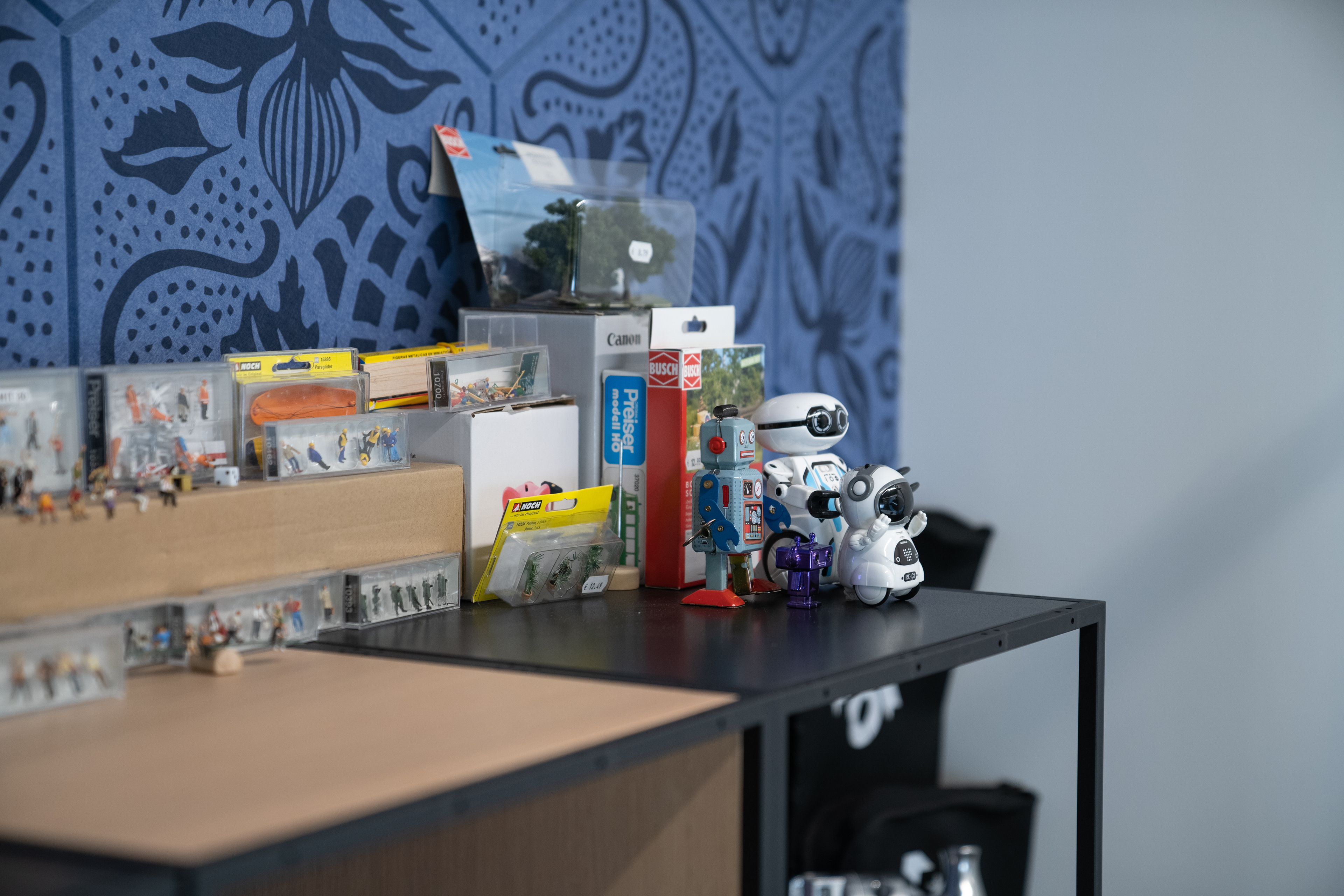
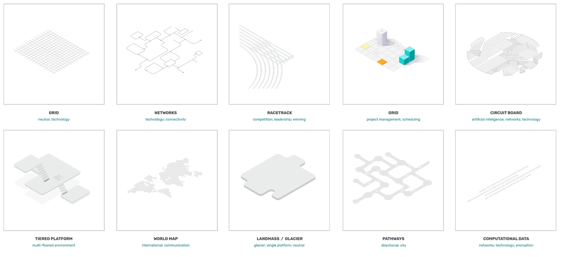
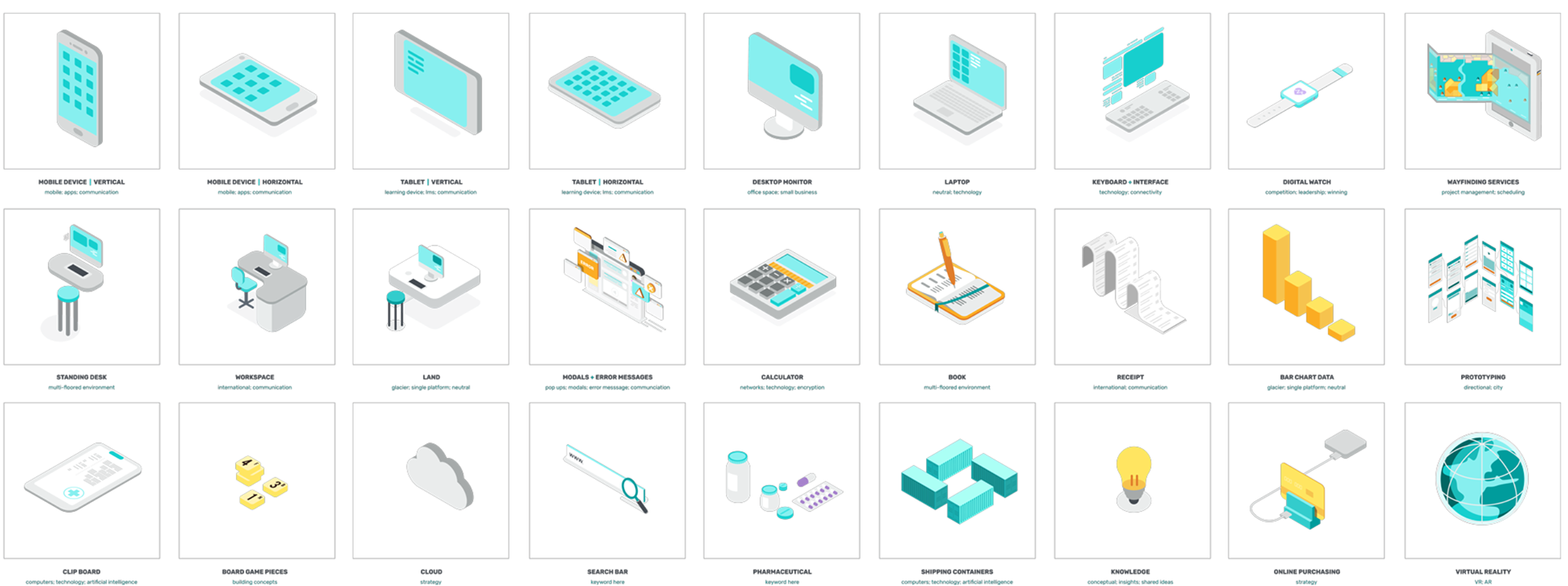
Itemized Components Sorted by Category
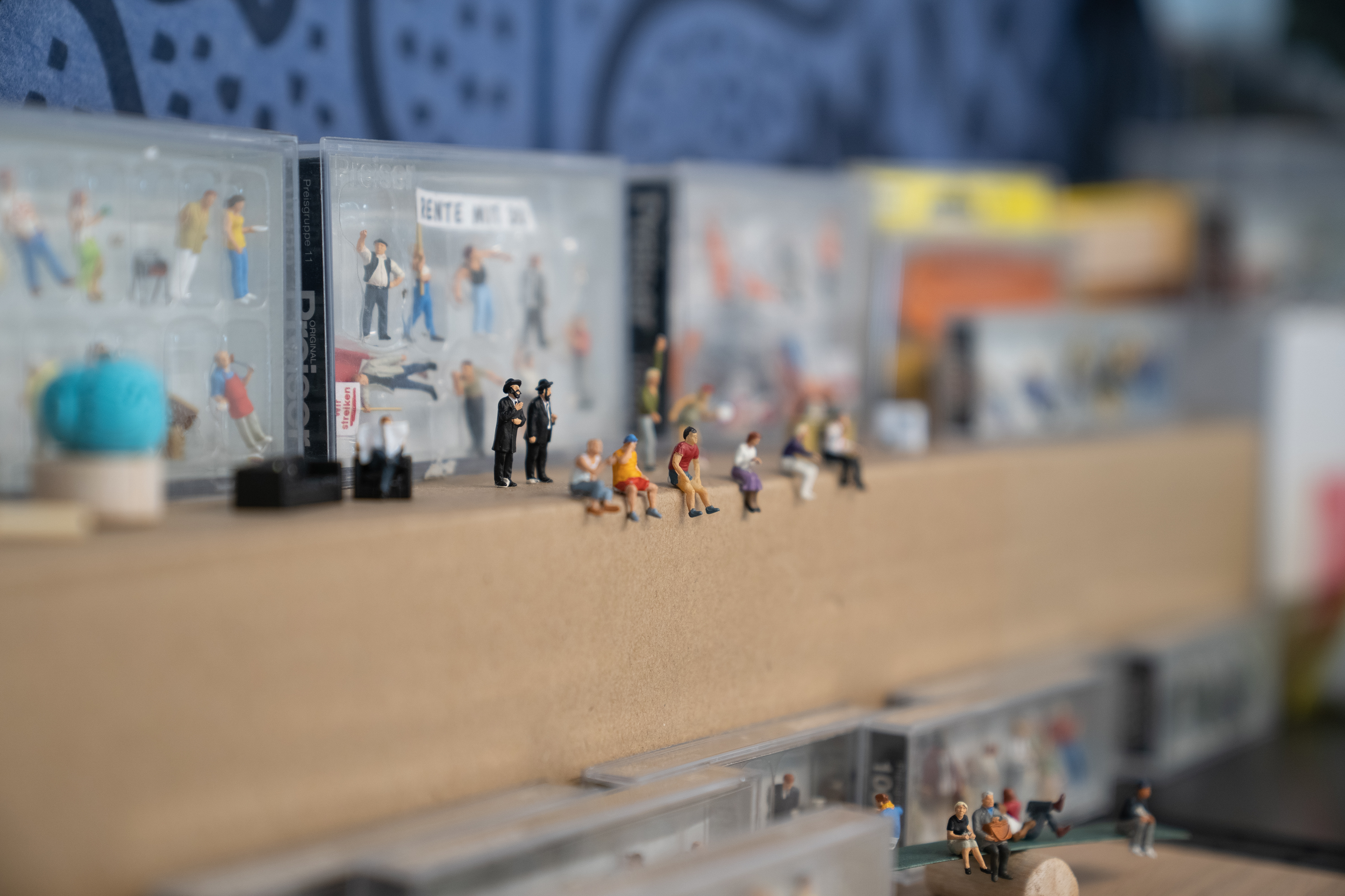
Diverse Range of People Figures
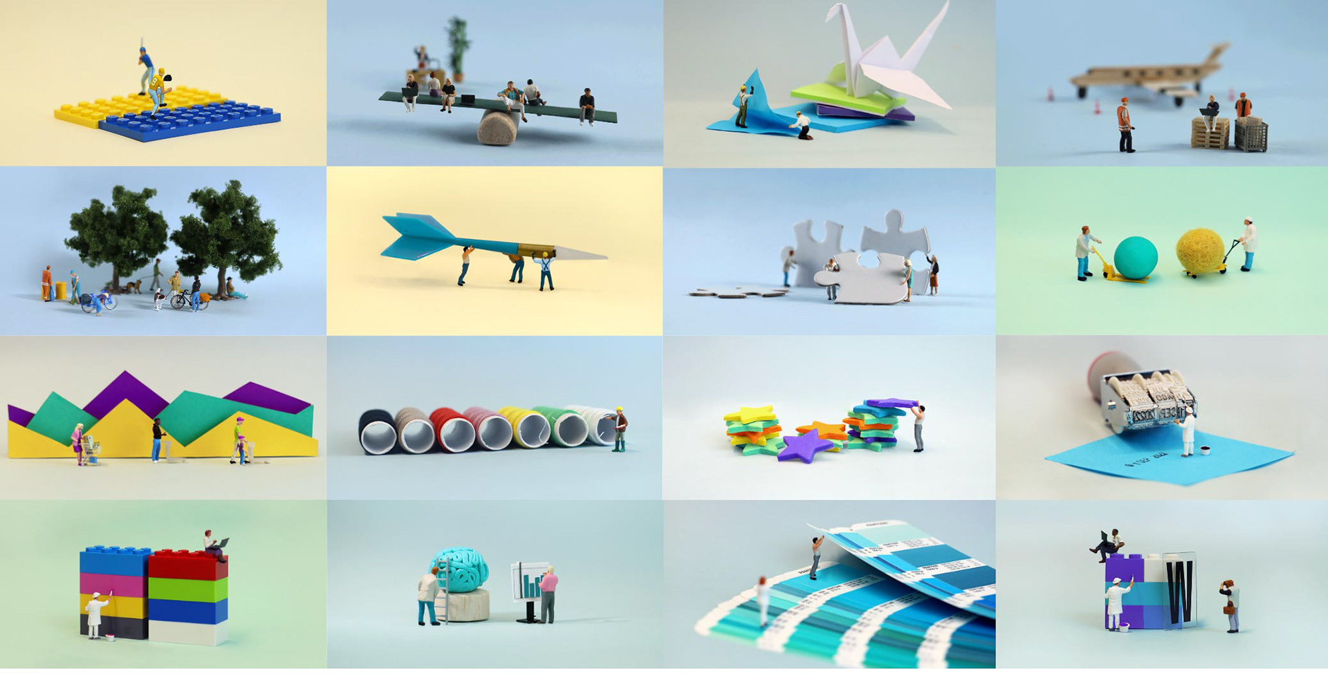
The inception of the Miniature Header Design System was a strategic response to fortify the content marketing arm of the GetApp brand. Characterized by its simplicity, the system leveraged everyday materials and a diverse collection of miniature figures to construct narratives accentuating technology and forward-thinking concepts. The deliberate use of isometric perspective, consistently threaded throughout our broader body of work, was seamlessly perpetuated in the captured imagery.
As time progressed, the system evolved into an extensive library, affording us the capability to narrate increasingly intricate stories through the artful deployment of these miniature figures. What began as a functional design approach transformed into an elevated art form, where the nuanced interplay of these diminutive elements allowed us to weave elaborate tales that resonated with our audience and further distinguished the GetApp brand in the competitive landscape.
Illustration Systems
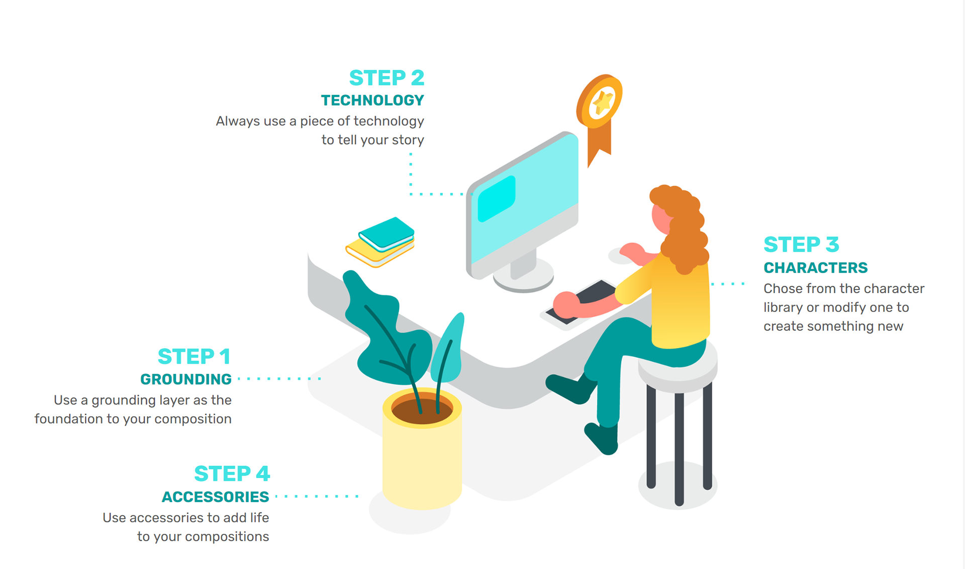
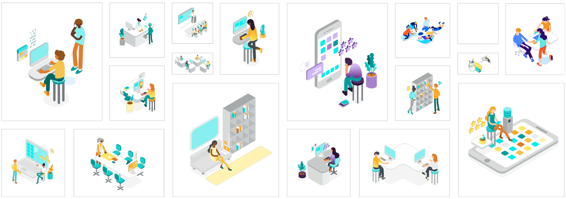
Within GetApp's content domain, the Miniature Header System stood as the predominant visual expression. However, when I recognized the need for diverse illustrations in materials such as infographics and eBooks, the imperative for a versatile system arose. This system demanded the ability to seamlessly reflect a broad spectrum of subject matter while maintaining modularity, ensuring accessibility for all team members.
In response, a structured set of rules governing composition anatomy was devised. With these guidelines in mind, an extensive library of components was curated, affording the design team the flexibility to construct compositions through the assembly of pre-existing elements; much like building a Lego set. This innovative approach alleviated the necessity to build designs from the ground up, streamlining the creative process and empowering team members to craft impactful visual narratives across a myriad of topics quickly and efficiently.
Video
Video Production: David Bukstein; Art Direction: Garvin G. Grullon